Wine Packaging Secrets You’ve Probably Never Noticed

When most people pick out a bottle of wine, they don’t start by reading what’s inside. They look at how it looks. The colour, the label, the shape of the bottle—it all adds up before the first sip is even poured. Some bottles seem fancy. Others seem fun. And that’s not an accident. It’s all part of the design. Wine packaging isn’t just about holding the liquid. It’s about grabbing attention and telling a quick story. And the coolest part? Most people don’t even realise how much those small details change how they feel about the wine. So, here are Wine Packaging Secrets You’ve Probably Never Noticed
Why the Label Matters So Much
A wine label might seem simple, but it’s doing a lot more than it looks. Think of it like a first impression. Before anyone even smells or tastes the wine, they’ve already made guesses about it based on what the label looks like.
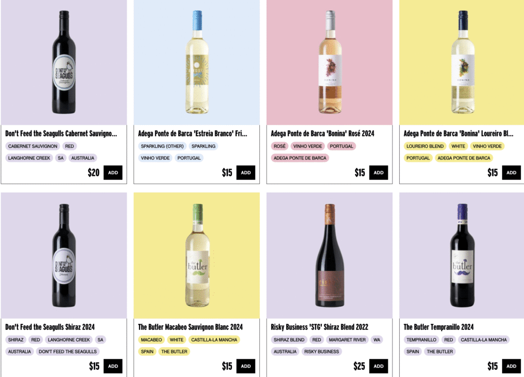
Some labels look old-school and serious, which makes the wine feel fancy or traditional. Others look modern or artsy, which makes the wine seem trendy or bold. Even the color of the label can make a difference. A soft, creamy label might feel calming and classic, while a dark, sleek one might feel strong and bold.
And it’s not just about design—personalization matters, too. Many winemakers today use personalised wine bottle labels to match special events, seasons, or brand styles. When labels are designed for a specific audience or purpose, they connect better. People notice. And more often, they buy.
Fonts, Shapes, and the Way the Label Feels

Now let’s talk about some smaller things—things that sound tiny but totally matter.
Fonts: Big swirly letters can make wine feel romantic or fancy. Clean, straight fonts can make it feel modern or high-end. Even the space between the letters changes how the label feels—tight spacing feels bold, while wide spacing feels calm or minimal.
Shapes: Most labels are rectangles, but not always. Some are circles. Others, wrap all the way around. Some are super small and tucked in the corner. That shape changes the vibe. A tall skinny label might feel elegant, while a wide one might feel bold or fun.
Texture: This one’s sneaky. A label that feels soft or rough changes how people think the wine inside will taste. If the paper is thick and textured, people might think the wine is rich or smooth. If the label is glossy and slick, they might expect something fresh or bold.
Colors Do Way More Than You Think
Colors aren’t just for looks—they actually change how people feel about a product. In wine, that’s a huge deal.
- Gold, cream, and black usually feel premium or serious. People might think the wine is expensive or perfect for special events.
- Bright colors (reds, oranges, yellows) can feel fun, bold, or creative. Those wines might be picked for parties or gifts.
- Cool colors (blues, greens, silvers) tend to feel fresh or clean, maybe lighter in taste.
Winemakers choose colors on purpose to match how they want the wine to feel. And those color choices can totally change how someone judges the wine—even before they try it.
Why Bottle Shape Isn’t Just About Tradition

Wine bottles come in different shapes, and it’s not random. Some shapes have been used for hundreds of years, and people connect certain shapes with certain types of wine.
For example, a tall bottle with sloped sides might be linked to a dry white wine. A short, wide bottle could feel more rustic or bold. Even though the bottle doesn’t affect the flavor, it feels like it does—and that’s powerful.
When someone sees a bottle that stands out because it’s shaped differently, it can be enough to make them stop and take a second look. That one second can be all it takes to make a sale.
How Labels Build Trust Without Saying Much
Wine can be confusing. There are so many types, regions, and flavours, it’s easy to feel lost. That’s why packaging that feels familiar, trustworthy, or helpful can make a big difference.
If someone sees a label that’s clear, clean, and well-made, they might think, “This wine must be good.” Even if they don’t know the brand or type, they feel safer picking it.
And when winemakers use personalized labels that match holidays, special events, or certain stores, they build even more trust. It shows they care about the experience—not just the product.
It’s Not Just for Big Brands
You might think only big companies can afford cool labels or custom designs, but that’s not true. Smaller wineries are using creative packaging to stand out in crowded markets. Personalized touches—whether it’s for a wedding, a private label, or a seasonal release—can help a small brand feel unique.
And when the packaging looks thoughtful, people assume the wine is too. That’s a big deal when someone’s trying a brand for the first time.
The Secret Power of First Impressions
Next time you’re looking at wine bottles, pay attention to what grabs your attention first. Is it the font? The shape? The texture? You might be surprised by how much those small details are influencing your choices.
Wine isn’t just judged by taste. It’s judged by the story it tells from the outside in. And that story starts with the label. Whether it’s bold, calm, fun, or classy, the label sets the tone. So even if the wine is the same inside, how it’s presented on the outside can totally change how people feel about it.
If you’re making or selling wine, or even just designing a label for a special gift, it helps to think about the small things—because those small things end up making a big difference.


